


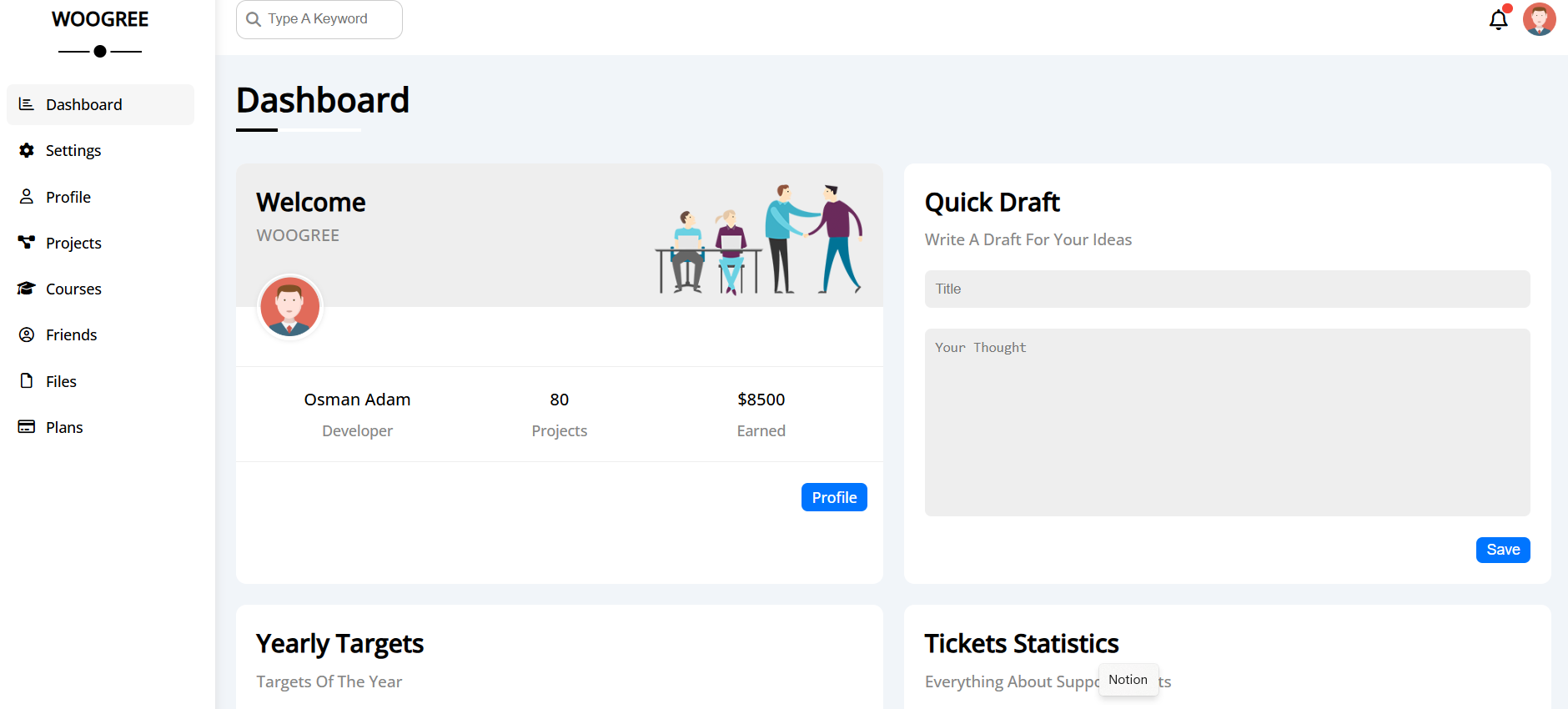
How it fits together
The template uses a fixed sidebar navigation (8 pages linked via href) with a responsive two-column layout. Each page loads the same CSS framework and master styles, maintaining consistent branding (color scheme, typography, spacing). The dashboard home (index.html) displays 15+ widget components—welcome card, quick draft, targets, tickets, news, tasks, uploads, project progress, reminders, social stats, and a projects table. Responsive breakpoints at 767px collapse the sidebar to icons and adjust grid layouts for mobile.
The template is built with semantic HTML5, CSS3, and vanilla JavaScript. It includes a custom CSS framework for reusable components and utility classes. The JavaScript handles sidebar toggling, dropdowns, and other interactive elements. The design is mobile-first, ensuring accessibility and usability across devices.